Case Examples: How Conservation Stories Are Often Framed
These examples show how the same images can be communicated in different ways—and how those choices affect clarity, trust, and understanding.
Case Example #1
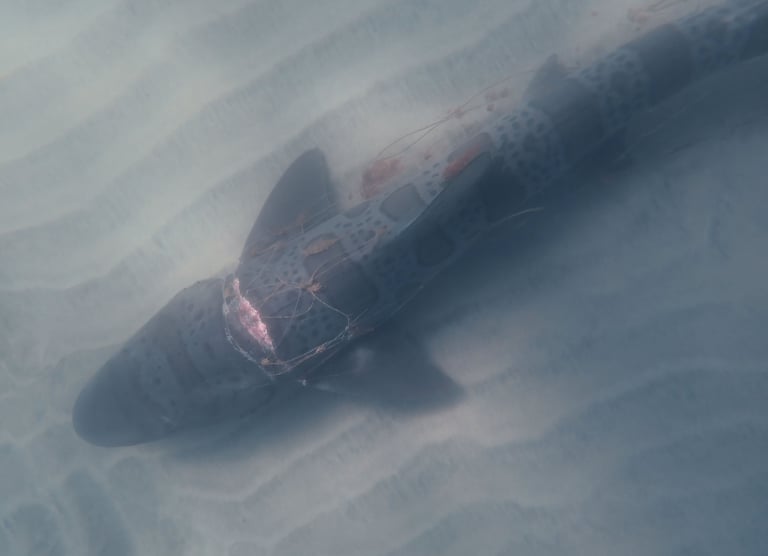
This shark was injured by discarded fishing nets.
This shark shows a severe entanglement injury, likely caused by fishing gear.
The difference is not the image—it is how meaning is constructed from it.
One version leads to a conclusion.
The other leaves space for understanding.
Reframed Approach
This shark was observed with a severe entanglement injury along its head and upper body, likely caused by discarded or lost fishing gear.
Entanglement in fishing gear—often referred to as ghost gear—is a documented and widespread issue affecting marine life globally. Estimates suggest that hundreds of thousands of marine animals are injured or killed each year due to lost or abandoned fishing equipment.
In many cases, the full outcome for an individual animal is unknown. During this observation period of several months, this shark was not seen again, while others in the same group continued to move through the area.
What is visible here is a single documented encounter—one example within a much larger and more complex pattern.
What You Can Do
There are several ways to engage with this issue:
Support organizations working on gear retrieval and prevention
Advocate for stronger regulations on fishing gear tracking and disposal
Reduce plastic use and support sustainable fisheries
Stay informed about how marine conservation efforts are funded and implemented
If you choose to support this work financially, look for organizations that clearly show how funds are used and what outcomes they achieve.
Case Example #2
In a recent audience survey, 60% of respondents reported that environmental messaging often feels confusing or overwhelming, and over half described it as difficult to trust—despite regularly engaging with environmental content.
This example is based on a widely shared sea surface temperature visualization and accompanying caption.
The graphic has been reconstructed to reflect the structure and framing of the original, while removing identifying details to focus on how presentation choices influence interpretation.
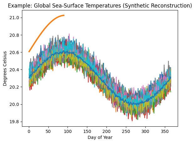

Global sea surface temperature 1982-2022, 2026 through Mar. 28 in orange , dark blue line 1982-2011 mean.
If rising fuel costs concern you, this sea surface temperature trend should be even more alarming.
Observations About the Visualization
The visualization presents sea surface temperature data across multiple years, with a recent partial year highlighted.
Several structural and contextual choices influence how the data is interpreted:
• Recent years (2023–2025) are not shown, despite being directly relevant to current trends
• The reference mean is based on an earlier time range (1982–2011), which does not include more recent temperature increases
• Individual years are not labeled, making it difficult to distinguish variability from trend
• The highlighted year is shown as a partial dataset, without full seasonal context
The accompanying caption links the data to a separate, emotionally charged concern (fuel costs), directing the viewer toward alarm through association rather than explanation.
These elements shape how the viewer understands both the magnitude and significance of the current values—while limiting their ability to independently assess what they are seeing.
What Changes in Interpretation
The difference is not in the underlying data, but in how it is framed.
In this presentation, emphasis is placed on a single highlighted trajectory, with limited context for comparison.
The viewer is guided toward interpreting the current values as exceptional and alarming, without being given the information needed to assess how they relate to recent years, known variability, or longer-term patterns.
The result is an immediate emotional response, achieved by narrowing context and emphasizing a single trajectory over broader variability.
This kind of framing aligns with—and likely contributes to—patterns that viewers report as confusing, overwhelming, or difficult to trust.
Reframed Approach
A complete presentation requires:
• clearly labeled recent years (including 2023–2025)
• a reference baseline that reflects both historical and recent conditions
• identification of variability across years
• contextual explanation of known drivers (e.g., seasonal patterns, climate cycles)
This does not reduce concern. It strengthens understanding by allowing the viewer to interpret the data within a complete and transparent context.
Why This Matters
The way data is presented shapes how it is understood.
When key context is omitted—such as recent years, baseline selection, or known variability—the viewer is not given the information needed to interpret the data independently.
Instead, emphasis and framing guide interpretation toward a specific conclusion.
This can create a strong emotional response, but it also reduces transparency about what is known, what is uncertain, and how current observations relate to broader patterns.
Over time, this approach can weaken trust—not because the underlying issue lacks importance, but because the communication lacks completeness.
A more transparent presentation does not diminish concern. It allows concern to be grounded in a clearer understanding of the data and its context.
This is not a question of whether the issue matters. It is a question of how understanding is built.
When interpretation is guided more by presentation than by context, understanding becomes dependent on trust in the communicator rather than clarity of the information itself.
Clear communication assumes that people are capable of engaging with complexity when it is presented with context.
Observation-driven interpretation
Conclusion-driven narative
Common Framing
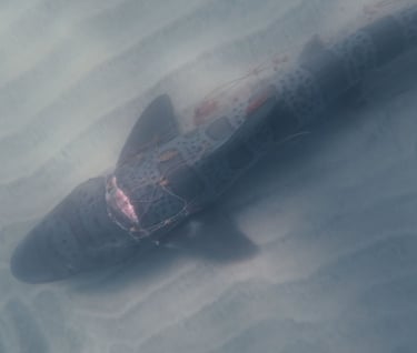
This injured leopard shark is a clear example of the growing impact of discarded fishing gear.
Across the world’s oceans, abandoned nets—often called ghost gear—continue to trap, injure, and kill marine life long after they are lost.
Hundreds of thousands of marine animals are injured or killed each year.
Without stronger protections and immediate action, this crisis will continue to escalate.
Your support helps remove deadly gear from the ocean and protect vulnerable species.
Donate today to support marine debris removal and conservation efforts.
Address
Seattle, WA 98101 USA
info@gatheredlightfoundation.org